emerge and surface
Are you ready to surface?
Tuesday, April 19, 2011
Friday, February 4, 2011
Wednesday, December 8, 2010
Robert S. Evans III
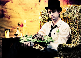
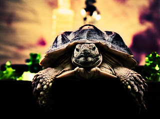 So I decided to have some fun with my own version of bleach bypass on some film I shot during a session with my friend and his pet tortoise. My take on the age old process is taking color negs and splitting the development part into 3 steps instead of its normal two my first step is developing in black and white film developer for x amount of time to bring up the true black layer of the film then proceeding into the remainder of the time in color developer. Finally giving the film just a taste of bleach so the film is completely with out high lights, but this step is to taste. Oh almost forgot you most rinse the film in between each step. This process can be temperamental so you have to test. Because I have killed many of roles playing with it.
JP Agustin

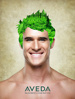
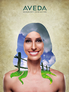
 Advertisement project I did for an advertising student back in 2nd term. He wanted to showcase natural ingredients of Aveda products by compositing natural elements as their actual hair. This was the mock up version. His final layout is different, but this is the files he sent me. Anyhow it was an easy gig and they got published in last months CMYK magazine.
JP Agustin
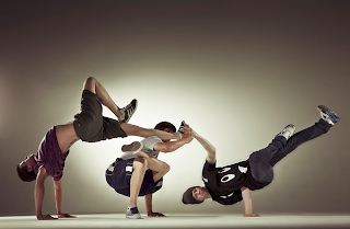

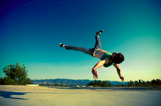
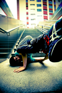
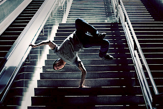 The first thing I started shooting when I picked up a camera was my bboy crew. I grew up in hip-hop and I was actually going to start a bboy magazine with my bboy/graffiti artist friend which is one of the reasons why I went to Art Center. After trying to market and recruit investors, we soon discovered that bboying and underground hip-hop culture is broke as fuck. We ended the project, but I still take pictures of bboys in the urban environment out of my own enjoyment.
week 13 Damon Casarez
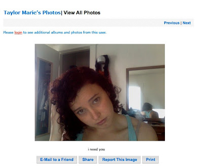
This is the first photo of a project that I have been wanting to start for a couple terms now and have finally made one image for it. This project is based on social networking websites, but myspace specifically. I'm interested in how people choose to represent themselves for the world wide web and what these representations say about my generation. This photo was created after a 15 year old girl's myspace photo I found when I was browsing around one day. This is a pretty accurate representation of her profile picture. I took a screen grab for the picture view layout and added the picture I had my friend take on her laptop mimicking the 15 year old girls photo.
Over the past year or so I have been collecting photos/screen shots of random public myspace/facebook profiles. I have noticed several trends in how people photograph themselves solely for their profile picture and also have seen different "characters" that I have found over and over again. Some of the characters I've often seen are black dudes holding wads of cash, so-cal bro's doing beer bongs/smoking weed, emo boys in the bathroom with eyeliner, lonely teenage suburban girl, the young girl who posts very sexual pictures of her self , "gang bangers," and a couple of grandma's trying to keep up with their grandkids by being on myspace. I'm fascinated by what photos these people choose to put up and what the photograph says about them and the digital generation in general. I'm always thinking about this project and what way to approach it and still haven't settled on a specific direction. I'm glad I did one photo though, just to test it out and see what people think about it.
WEEK 12 Damon Casarez
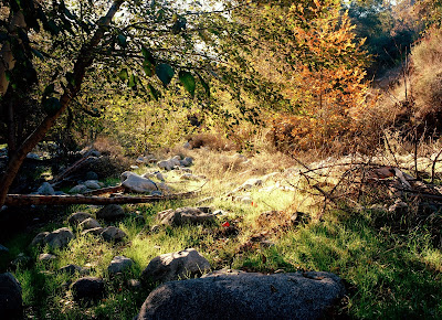
Red Cups
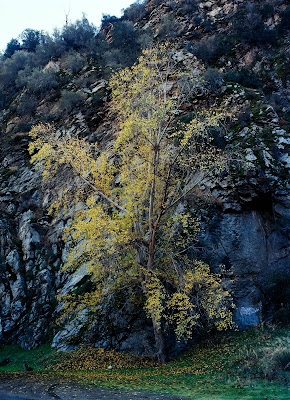
Grafiti
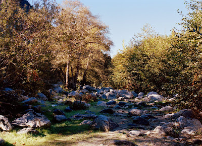
More Tagged Rocks
This is the 2nd day I shot for my Azusa Canyon Project. I went for about 5 hours this time and walked a few miles and still saw a bunch of garbage around. It usually dies down after the 1st mile, but not here. These photos are a little more subtle than the first post from the series. It was refreshing to just get out and shoot with no schedule, lighting set up or people to deal with. There is 20 photos that will be in the book all shot in Azusa Canyon, mostly around the areas surrounding the San Gabriel River, which has a North, West and East fork in the river
Week 11 Damon Casarez
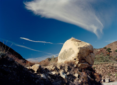
Painted Rock
This is a new series of landscape photographs I started last week for my 2nd book for design 2. This project is documenting the landscape of Azusa Canyon in the Angeles National Forest. I've been going here for a few years now for the fishing and because its a nice get-away spot thats only about 40 min away from me. When I first came to the canyon about 4 years ago, I was shocked at how beautiful it was for being so close to L.A. and the fact that there is a natural flowing river in L.A. County with fish. When I really started to explore the canyon, I immediately noticed the garbage and graffiti from people who hang out at the river with family or friends or camp there. I was so sad and shocked to see all of this trash polluting the river and the graffiti on the rocks, that will be there forever.
I photographed the Canyon according to how I first experienced it 4 years ago, being taken away by its beauty but always seeing the trace of human beings upon take a closer look. The human trace is supposed to be a second read in the photographs. I intentionally photographed the landscapes in a very traditional manner to not only focus on the trash/graffiti, but definitely showing my awareness of it in the photographs. Some photographs are more subtle than others. This was the first day I went to shoot for the project.
Tuesday, December 7, 2010
That Willow Smith song: Photographer: Karla
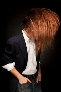 This is a start of a series of photographs that I'll be doing on men with long hair. I like the idea of dressing these guys up in nice clothing and having them head bang. It's fun not really knowing exactly what I was going to come up with. I think the next step is to take them out on actual locations rather than the studio. I think it would be cool to see them in fancy rooms in nice clothing just head banging away. We'll see how it goes though, I found this hotel I really wanted to shoot at and was told it would cost me 5,000 to shoot there and that was their "student rate". Give me a break.
Portrait: Photographer: Karla
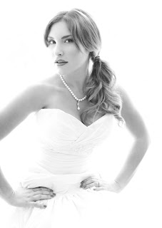 Just a simple black and white portrait I took over the summer. I took the summer term off and was really wanting to shoot. So I put the casting up for a model, had her wear this dress and snapped some photos. We wound up walking around the queen mary in long beach. You'd think that I would have chosen a photo with all the boat stuff in the background but I like this one the most. Maybe just because its simple and pretty :)
Fashion: Photographer: Karla
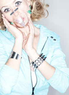 For this shoot I wanted to kind of mimic the lighting style of the no hate campaigns. So I checked a ringflash (which i never shoot with) out from the equipment room and my friend came by to model for me. All in all it was pretty fun but I don't see myself shooting like this all the time.
Coach product shot: Photographer: Karla
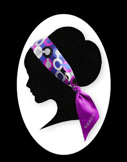 This photo comes from a project I started a few terms ago and have yet to finish. I took photos of the head scarf, scanned in a cut out of the silhouette, and composited them together. Honestly, I have no artistic ability in cutting things out so the project was pretty difficult. Next time I think I'll try and get an illustrator to draw them for me :P
Labels:
coach,
color photography,
Karla Kennedy,
product photography,
silhouette
Left to My Own Devices - John Casey Harris Week 13
I was at the Coffee Bean near Sunset Plaza with my friend Steven; we were out to draw dinosaurs and hopefully see Laura Dern (because, why not).
I started sketching a tyrannosaurus, when I added a rider and from there I added a triceratops. I started sketching a second rider when Steven commented that it sort of looked like Angela Lansbury. STROKE OF GENIUS. Literally rolling on the floor, foaming at the mouth, dreaming of the possibilities. Angela Lansbury + Dinosaurs?!? Somewhere, Einstein's ghost was racking his brain with the mathematics of this truly momentous occasion.
A few flicks of the pen and my second rider was officially Angela, but we got to musing and trying to create a story... could we one up Angela Lansbury? A tough order to be sure, but we came up with one better... but that's something I'll have to save for later... because its still a dream rattling around inside our heads and not yet ready for prying eyes :)
Its just a pen and ink sketch, but conceptually its one of my favorite things I've done this term.
Let him eat cake! : Photographer: Karla
 This shoot was simple, had a lot of fun doing it actually. The little boy was so cute and was no stranger to being in front of the camera so it made my job so much easier. His mom wasn't too thrilled about the icing on his fingers but she let him do it anyway. The funny part is that he kept wanting to smash his face into the cake...which could have been fun except that the cake was a prop ;) so having styrofoam in his face wouldn't have been a great idea.
Haunted Mansion - A Work in Progress - John Casey Harris
Just Some Doodles - John Casey Harris
Week#12 Robert S. Evans III
Week 13: Photographer: Karla
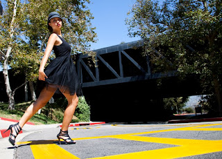
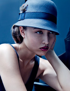 These are just a few fashion photos I took on campus. I brought the wardrobe and the rest is pretty self explanatory :P I took them during the fashion class and this was probably my favorite shoot from the whole term.
week#11 Robert S. Evans III
Subscribe to:
Comments (Atom)


